


The Ionic Grid System
Ok we have everything setup now and we can run our app in the browser.
Ionic's most powerful advantage is its cross-platform nature.
You can create an app for desktop, tablet, smartphone without wasting time building multiple applications.
Most of that is thanks to HTML5 and CSS3.
The first time I encountered Responsive Design was five years ago with (Twitter) Bootstrap. Everything was built upon a grid system.
If you already know this system, good news: the Ionic Grid System abuse of it.
This system is composed of three elements:
- <ion-grid>: The big daddy
- <ion-row>: Creates one row with all the content inside
- <ion-col>: A row will be divided in multiple columns
All of this is not magic: mainly SCSS.
The SCSS comes preconfigured, an example of default configuration is the row's area divided in 12 columns.
However, this can be overridden in a SCSS file: the variables.scss file (more on that later).
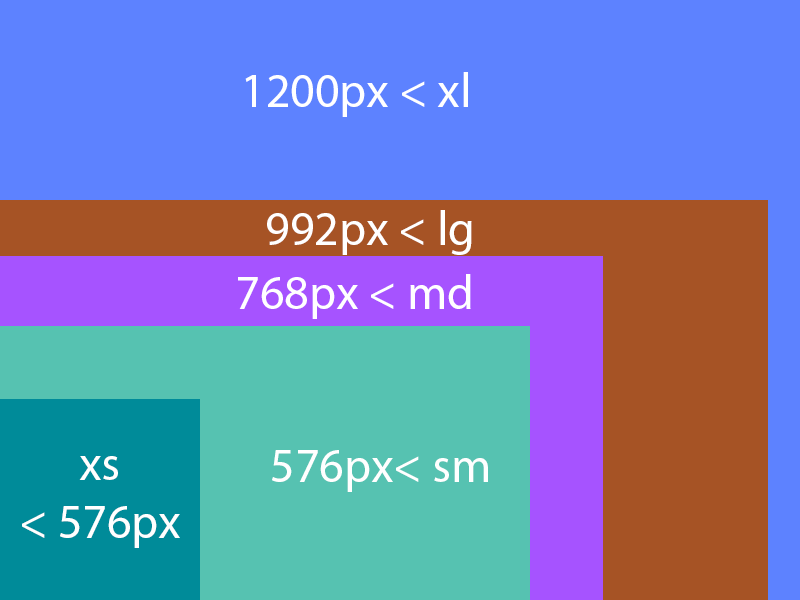
Responsive design creates breakpoints that will impact the style depending of the screen's resolution.
The following representation can be used:
Moving on to the features, we will have a look at:
- Space allocation
- Offset usage
- Content pulling and pushing
- Vertical and horizontal alignment
- SASS customization
Space allocation
An <ion-row> Element contains some <ion-col> Elements, it will position the elements according to the screen's resolution.
Syntax wise, if we want to divide a row, it's pretty similar to the representation above using the col- attributes:
- xs: col-X
- sm: col-sm-X
- md: col-md-X
- lg: col-lg-X
- xl: col-xl-X
Where X is the number of columns we want to allocate to the <ion-col> element.
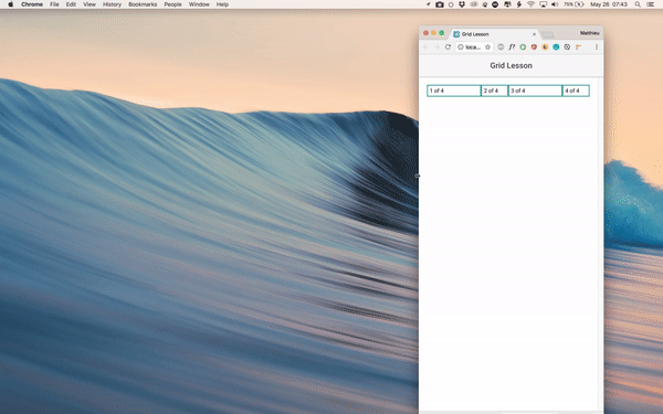
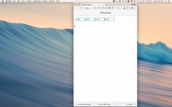
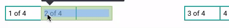
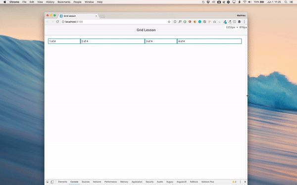
Here is an example of 4 <ion-col> elements, each one occupies 2 columns.
  <ion-grid>

    <ion-row>

      <ion-col col-2>
        1 of 4
      </ion-col>

      <ion-col col-2>
        2 of 4
      </ion-col>

      <ion-col col-2>
        3 of 4
      </ion-col>

      <ion-col col-2>
        4 of 4
      </ion-col>

    </ion-row>

  </ion-grid>
Using the col- attribute, this space allocation will affect every devices which resolution is wider than 0 px so basically everything.
This is the result:

As you can see, only 8 columns are used, the remaining 4 (12-8) are empty.
This col-2 will set the width to 16.6%.
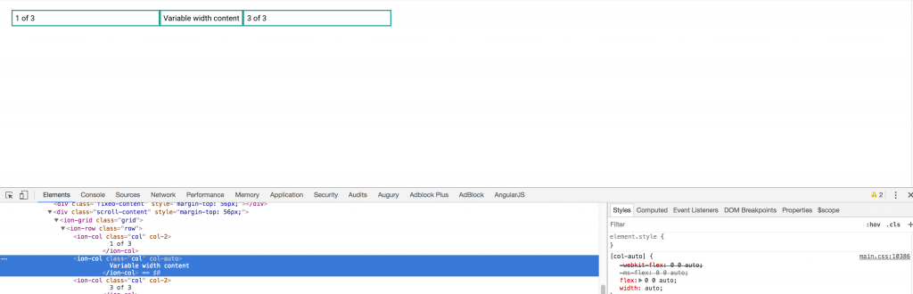
If we want the column to inherit the size of the content, the col-auto attribute can be used:
    <ion-row>

      <ion-col col-2>
        1 of 3
      </ion-col>

      <ion-col col-auto>
        Variable width content
      </ion-col>

      <ion-col col-2>
        3 of 3
      </ion-col>

    </ion-row>
Result:
Finally the most useful feature: Attribute Stacking.
The breakpoints are as follow: col -> col-sm -> col-md -> col-lg -> col-xl.
If there are other col- attributes on an <ion-col>, they will only enter in the game once the screen passes the breakpoint.
Here is an example with multiple breakpoints:
    <ion-row>

      <ion-col col-4 col-sm-2 col-md-4 col-lg-2>
        1 of 4
      </ion-col>

      <ion-col col-2 col-sm-4 col-md-2 col-lg-4>
        2 of 4
      </ion-col>

      <ion-col col-4 col-sm-2 col-md-4 col-lg-2>
        3 of 4
      </ion-col>

      <ion-col col-2 col-sm-4 col-md-2 col-lg-4>
        4 of 4
      </ion-col>

    </ion-row>
The space allocation will change for each <ion-col>, alternating between two and four columns.
Result:
Offset usage
Sometime you might need some spaces between two <ion-col> elements, that's when the offset attribute can be used.
This example creates some offset, but only if the screen's resolution is wider than 768px (md):
    <ion-row>

      <ion-col offset-md-2 col-2>
        1 of 4
      </ion-col>

      <ion-col offset-md-1 col-2>
        2 of 4
      </ion-col>

      <ion-col col-2>
        3 of 4
      </ion-col>

      <ion-col col-2>
        4 of 4
      </ion-col>

    </ion-row>
Result:
Analyzing one step further, we can see that a margin is created:

Content pulling and pushing
Pulling and pushing is another answer to positioning.
This action can be done to the left (pulling) or to the right (pushing):
    <ion-row>

      <ion-col col-2>
        1 of 4
      </ion-col>

      <ion-col col-2 pull-md-1>
        2 of 4
      </ion-col>

      <ion-col col-2 push-md-1>
        3 of 4
      </ion-col>

      <ion-col col-2>
        4 of 4
      </ion-col>

    </ion-row>
Result:
Pulling and pushing can be confused with offsetting, however it's very different, taking a closer look, we see that the <ion-col> elements are overlapping:
Vertical and horizontal alignment

Yep, this thing annoys us all the time.
With the arrival of Flexbox, it's now easier to align elements in every decent browsers (f**** you IE).
A complete CSS lesson on Flexbox is available there, we will just focus on the most encountered use cases.
Starting with horizontal alignment:
    <ion-row justify-content-start>

      <ion-col col-3>
        1 of 4
      </ion-col>

    </ion-row>

    <ion-row justify-content-center>

      <ion-col col-3>
        1 of 4
      </ion-col>

    </ion-row>

    <ion-row justify-content-end>

      <ion-col col-3>
        1 of 4
      </ion-col>

    </ion-row>
The justify-content- attribute can position at the:
- start: Equivalent to align-left
- center: Equivalent to align-center
- end: Equivalent to align-right
Result:

As for vertical alignment:
  <ion-row>

    <ion-col align-self-start>
      <div>
        1 of 4
      </div>
    </ion-col>

    <ion-col align-self-center>
      <div>
        2 of 4
      </div>
    </ion-col>

    <ion-col align-self-end>
      <div>
        3 of 4
        <br><br><br>
      </div>
    </ion-col>

    <ion-col align-self-baseline>
      <div>
        4 of 4
      </div>
    </ion-col>

    <ion-col align-self-stretch>
      <div>
        4 of 4
      </div>
    </ion-col>

  </ion-row>
The align-self- attribute can position at the:
- start: Equivalent to align-top
- center: Equivalent to align-center
- end: Equivalent to align-right
- baseline: The element is positioned at the baseline of the container
- stretch: The element is positioned to fit the container
Result:

SASS customization
This part can be dangerous.
You need to be conscious of what you are doing (aka don’t do this type of modification after an open bar party).
The Ionic Team allows us to override some preconfigured CSS values. This can be done in the variables.scss file.
Here is an example where the resolutions breakpoints are modified:
$grid-breakpoints: (
  xs: 0,
  sm: 900px,
  md: 1000px,
  lg: 1100px,
  xl: 1200px
);
Which leads to earlier columns changes:
Or we can modify the number of columns available in a row:
$grid-columns: 10;
Which leads to:

Messing up our beautiful columns…
There is not enough space here for 12 columns so the last one is moved below.
So … set all the properties before starting the UI, otherwise if you change your mind halfway, your UI will look like this:

Conclusion
The Ionic Grid System is quite simple to master, it’s all about adding an <ion-grid> Element which will contain some <ion-row> which will contain some <ion-col>.
We can use some attributes that will enter in the game once a breakpoint is reached.
The Grid System is based on the Flexbox system which means that we can easily modify the SCSS flow to align our content.
Finally, the Grid’s core SCSS can be modified as we want.